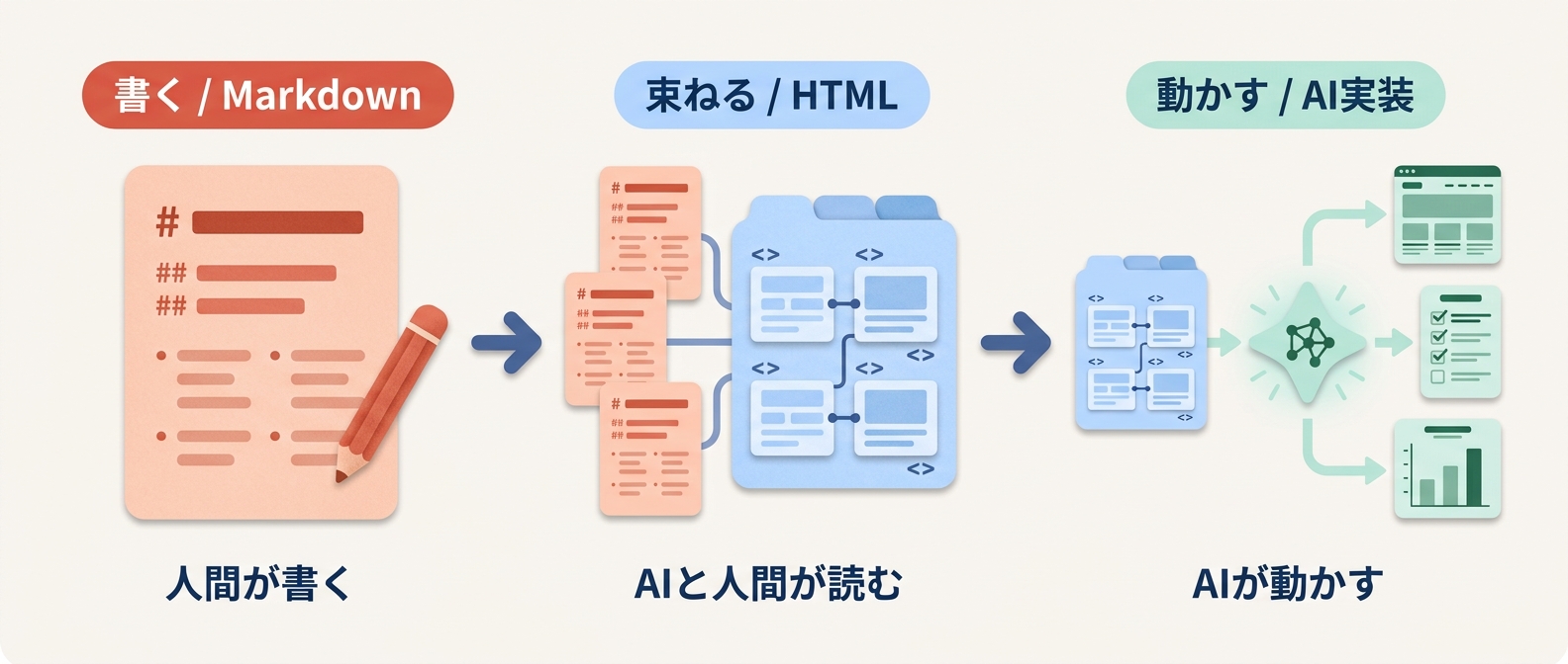
書く
Markdown
- about.md
- style.md
- task.md
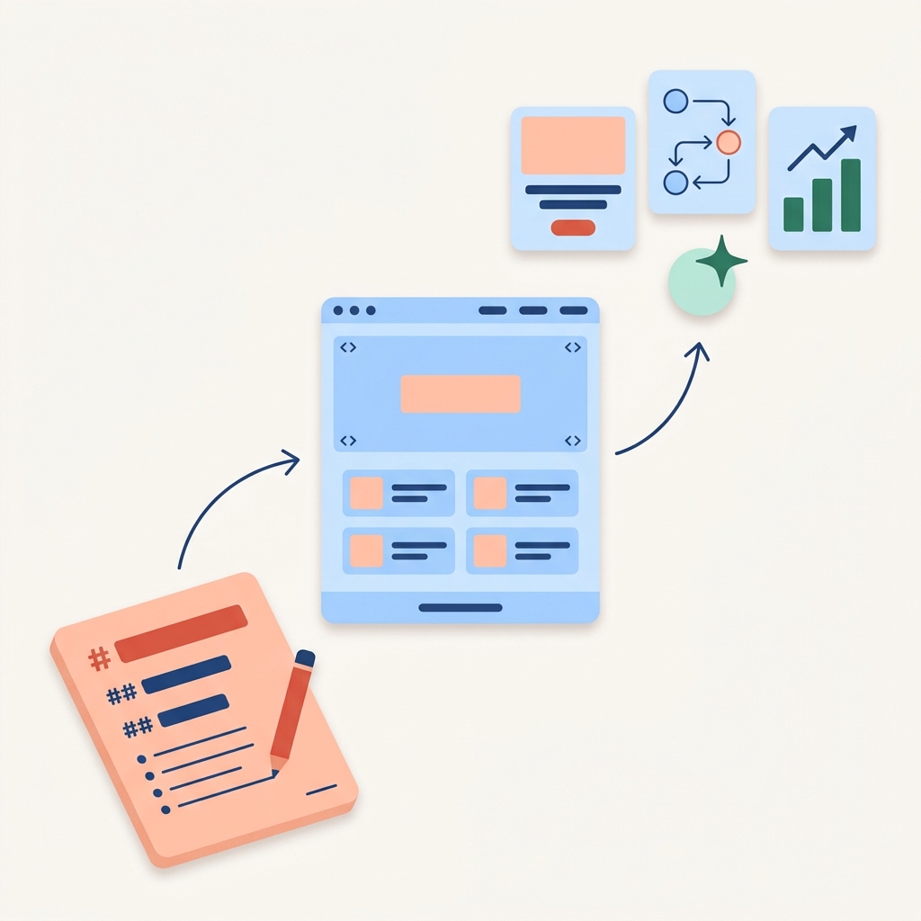
Markdownで書き、HTMLで束ねる。
AIと人間の共通の設計書をつくる作法を学べます。
Markdownで書き、HTMLで束ねる。
これがMARKURUの研修の中心メソッド。
AIと人間の共通の設計書をつくる作法を、ワークショップ形式であなたの業務に組み込めるかたちで身につけます。
AIを業務に取り入れたものの、こんな壁にぶつかっていませんか。
プロンプトの試行錯誤ではなく、AIに正しく届け、人間が後から辿れる再現可能な作法。
MARKURUの研修で学べば、AIの出力をあなたの思い通りに動かせるようになります。
この設計言語を、あなたの業務シーンに合わせて身につけるのがMARKURUの研修です。
設計言語を構成する 3つの.md(Markdown)と 3種のHTML の具体的な作法をご紹介。
研修プログラムを見る →
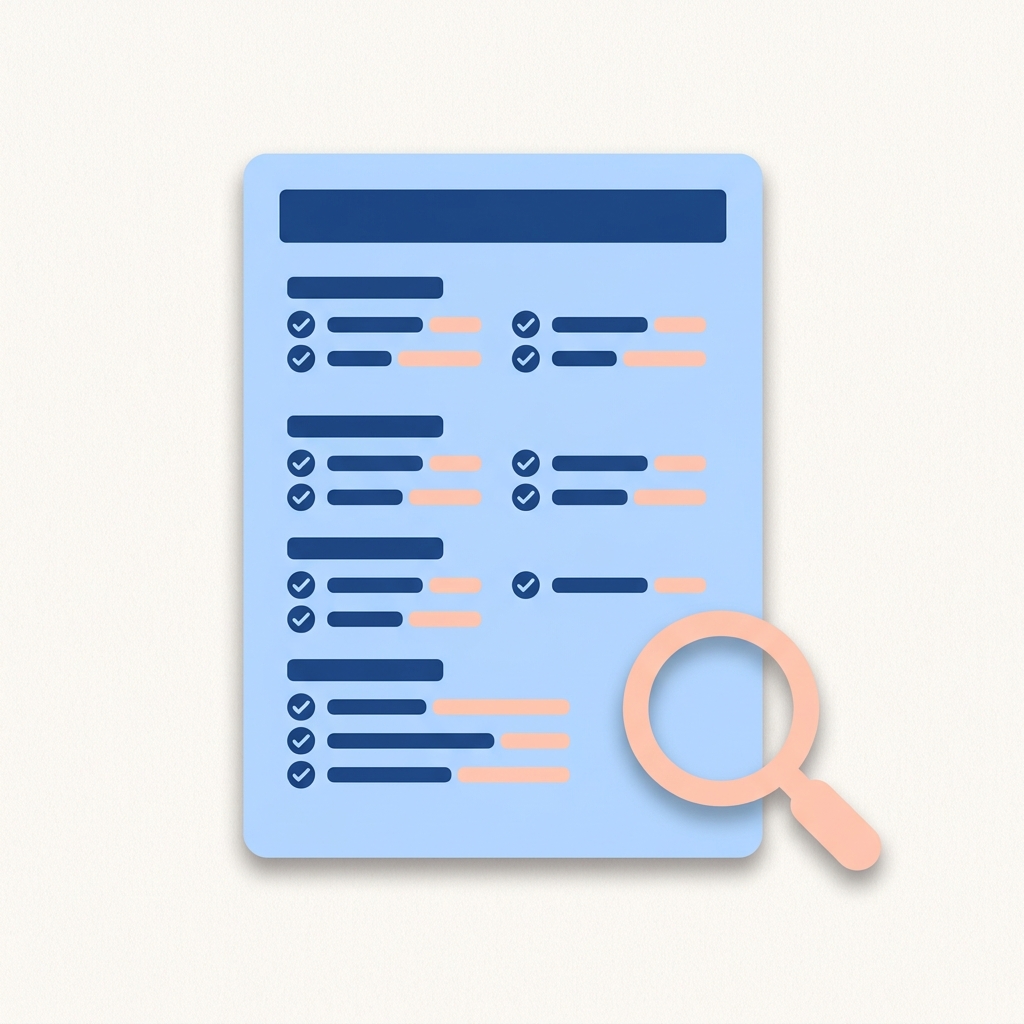
研修で身につける具体的な作法を、サンプル付きで解説します。
.md で、思考と意図をAIに渡すわたし/答え方/依頼。この3つを書き分ければ、AIの出力は劇的に安定します。各カードをクリックすると、実際のサンプルが開きます。
about.md
書く前:毎回「うちの会社は…」と背景説明から始まる。AIの提案も的外れ。
書いた後:AIが文脈を理解した状態でスタート。「次の案件どう攻める?」だけで、自分の言葉で返してくる。
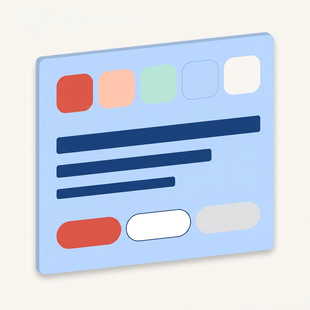
style.md
書く前:同じ依頼でも、その日の気分で「ですます」だったり「である」だったり。出力の体裁がバラバラ。
書いた後:誰が使っても、いつ頼んでも同じ型で返ってくる。組織で配布できるのはこのレイヤーがあるから。
task.md
書く前:長いプロンプトに前提・口調・依頼を全部詰め込む。書く側が疲れて、結果もブレる。
書いた後:1と2が効いているので、ここは箇条書きでOK。書くのが楽になり、出力は安定する。
ここまでが「書く」レイヤー。
次は、これらを束ねて、AIと人間の共通仕様書にします。
Markdownは書きやすい。
でも、後からチームやAIが読み返すときには、もう一段の構造が要ります。それがHTMLです。
意味のあるタグで書かれているから、AIが構造を取り違えない。
URLひとつ渡せば、誰でもすぐ参照できる。
仕様書からデザインルールへ。設計が散らばらない。
spec.html
何を作るかを、AIと開発者が同じ場所で読める形に。
design-system.html
色やトーンを、ブラウザで開ける設計書に。
workflow.html
定常業務の手順を、チームの共通資産に。
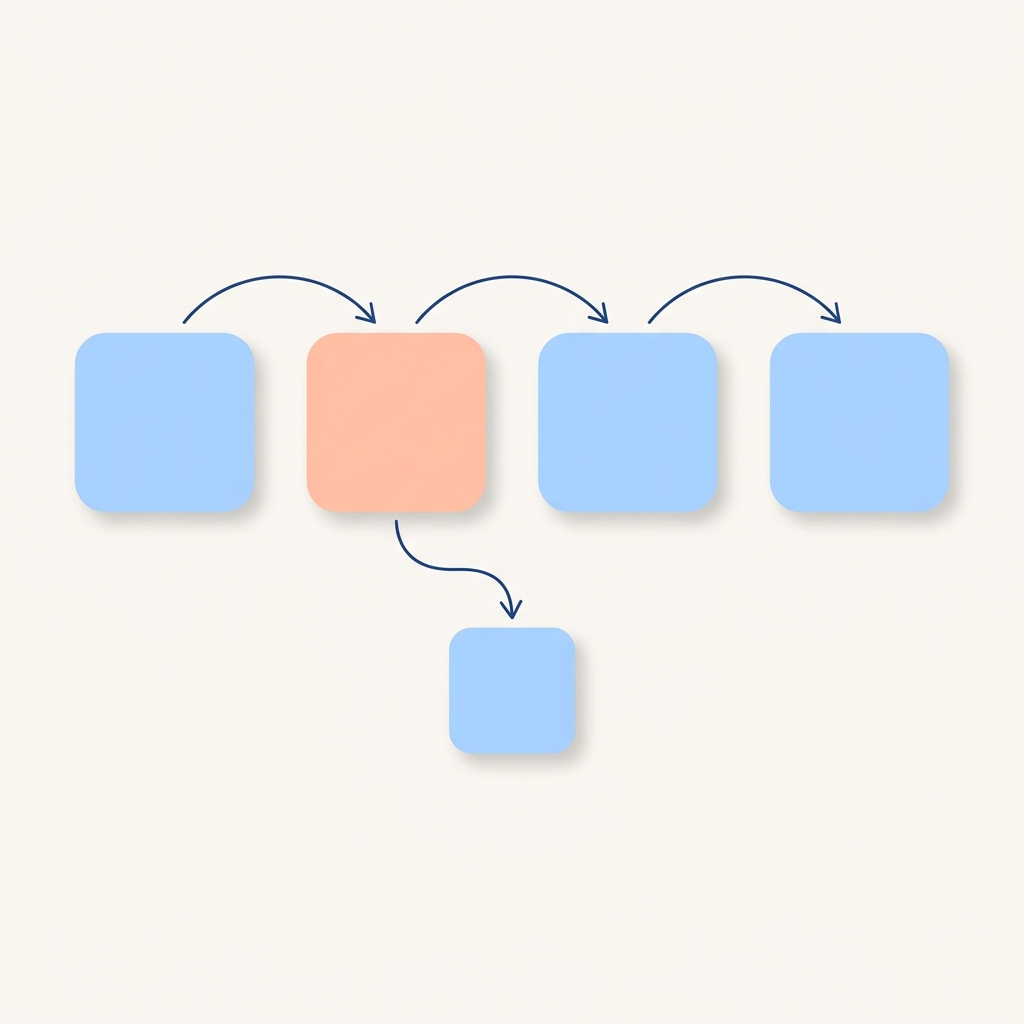
3層のMarkdownと、3種のHTMLを起点に、業務に必要なファイルを足していくだけ。
必要なときに、必要なだけ。すべて講座でカバーします。
policy.md
やってほしくないこと、機密情報の扱い、出力の検証ルール。組織で安全にAIを使うための守りの設計。
design.md
色・タイポ・トーンの世界観統一。design-system.html へ束ねれば、AIがそのまま再現できるブランドの設計図になる。
workflow.md
複数AIをつなぐ手順書。workflow.html へ束ねれば、月次レポート・問い合わせ対応など定常業務をAIに任せる仕組みに。
project.md
案件固有の制約・関係者・KPI。spec.html へ束ねれば、チームでAIを使う際の共通言語になる設計図に。
業務シーンが違えば、推奨AIと書く .md、束ねる .html も少し変わります。
推奨AIはあくまで目安。設計言語の核は特定のAIに依存しないので、
お手元の環境で、いま使えるAIから始められます。
AIが進化しても、設計書はあなたの資産として残ります。
どの研修も共通の核は「設計言語」。書く(Markdown)と束ねる(HTML)の二層を、ワークショップ形式であなたの業務シーンに合わせて身につけます。
workflow.md → workflow.html で組織展開業界・職種を超えて、設計言語が日々の仕事を変えはじめています。
毎朝、提案書のたたきを作るのに2時間かかっていました。persona.md と rules.md を整えてからは、30分で同じ品質のドラフトが出せるように。AIが急に頼れる部下になりました。
PdMとして仮説検証のスピードに悩んでいました。CLAUDE.md と design.md を書き、spec.html で束ねれば、Claude Codeが動くLPまで作ってくれる。エンジニアの工数を借りずに検証が回せるのが革命的です。
全プログラムを、かめち(株式会社HuX代表)が直接担当します。

元プログラマー・インフラエンジニア。ディップ株式会社で「dip Robotics」立ち上げ・AI&DXプロダクト推進責任者を経験。2025年に株式会社HuXを設立し、現在は複数企業のAI戦略推進を伴走。
説明会でよくお問い合わせいただく内容です。
spec.html / design-system.html 整備の伴走もオプションで提供します。
AIは、来年も再来年も、新しい名前で登場する。
でも、あなたの設計図は、ずっとあなたの資産として残ります。
書き始めるのに、最適な日は今日。
AI活用の市況と「設計言語」の考え方を、講師(かめち)が45分でお話しします。
本講座は、自分の業務を持ち込むワークショップ形式。まずはセミナーで全体像を掴んでください。